Leneda - Visualizing your energy data
Exciting Update: Visualizing Your Energy Data with Leneda! 🚀
We’re thrilled to introduce a brand-new feature in the Leneda application that’s set to enhance your experience! With our latest update, energy data is now visualized in a clear, graphical way, making it easier than ever to understand your energy consumption and production behaviours. Whether you’re a consumer, producer, self-consumer or energy sharer, this feature is designed to simplify and bring more clarity to your energy flow patterns.
🔗 New graphs available
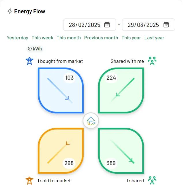
The first new graphical representation is based on the energy measurements at your premise, showing an overview of four key energy flows:
- Energy the customer is buying from the market
- Energy the customer is selling to the market
- Energy that is shared with the customer (shared by himself or by another one)
- Energy the customer is sharing with himself or someone else
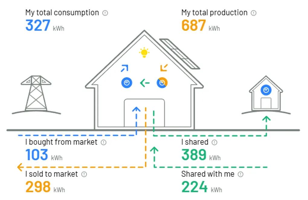
These visualizations help you quickly identify and track how energy is flowing to and from your home or business.
More Detailed Insights
The second set of graphs goes even deeper, offering a detailed breakdown of energy flows based on your specific appliances and measurements. This allows for a more nuanced view of your energy usage and production, making it easier to optimize and manage your energy patterns.
Stay Tuned!
We’re constantly working on improving Leneda, and this is just one step in bringing you more powerful tools and a smoother user experience. We’re committed to helping you get the most out of your energy data, and we can’t wait to bring you even more exciting updates soon! Happy usage and enjoy the new feature! 💻